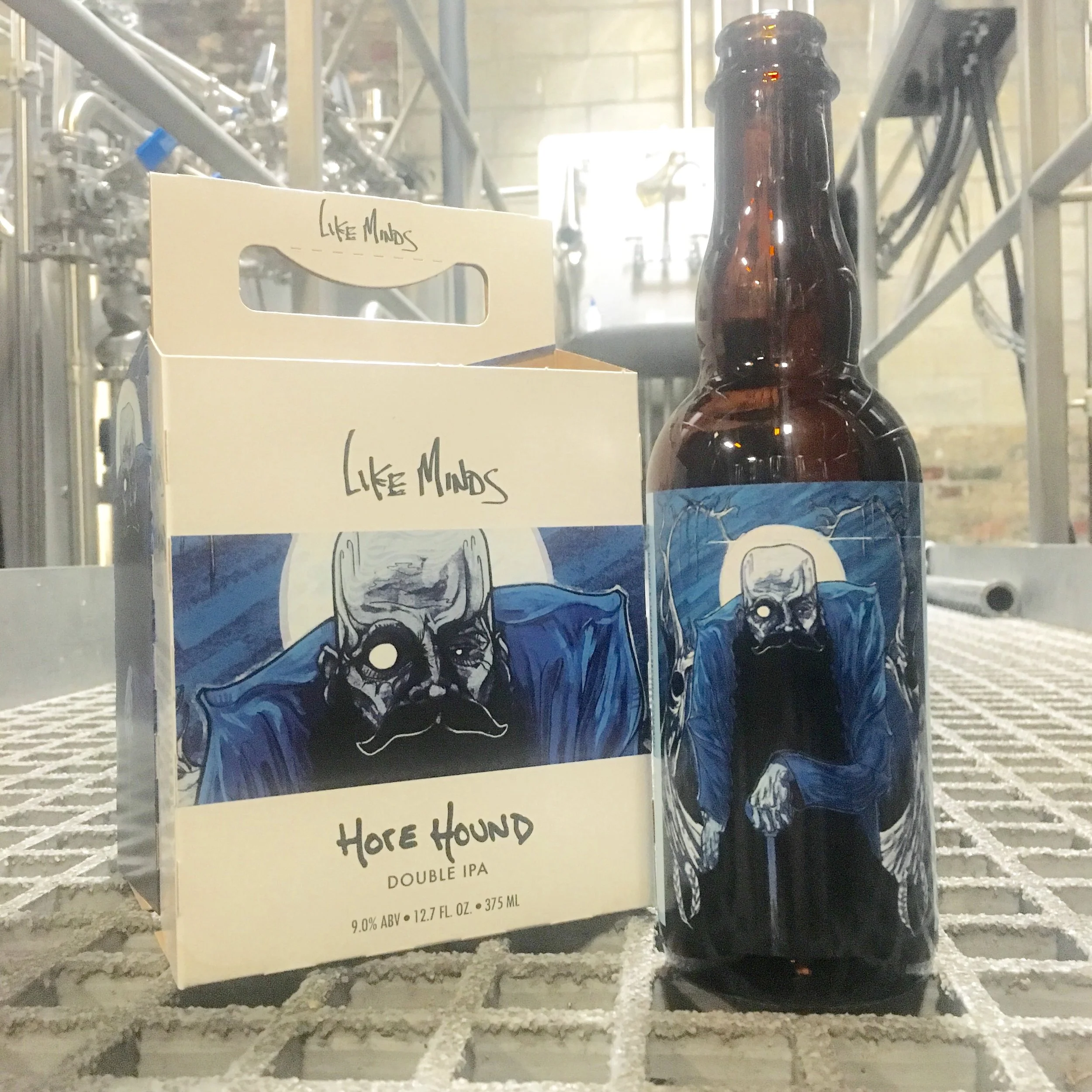
As beer labels and art prints deriving from them make up a heavy portion of my portfolio, it seemed proper to start these postings with my first label project, Horehound.
My process began with sketching (and filtering) out any and all expected beer imagery, mostly hop and grain related graphics. I’ll specify that the reason to avoid this imagery is due to my own personal fatigue with seeing how many ways these icons are used across the visual portion of the industry, I’d also like to note that I too have since fallen into utilizing this imagery in various projects.
The process in building this image was what ended up becoming the approach to most all of my illustration work going forward. Research was the point of inspiration, starting with what the fuck (pardon) is a Horehound? To avoid this becoming a research paper, horehound is a plant in the mint family, it has been used for various medicinal purposes by many cultures over history. Initially I played with the idea of vintage medicinal labels, something that felt too limiting and ultimately misleading. Further research lead me to find that the plant was thought to be named after Horus, the Egyptian god. As someone who’s always been fascinated with this part of history I was happy to use this as a springboard for visual ideation. Although it was a lot of fun to try and incorporate the graphic nature of Egyptian symbols into a more illustration-heavy scene it just wasn’t working from a label standpoint.
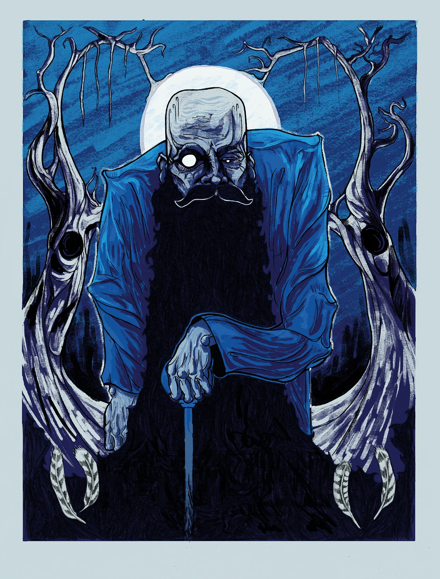
In a much more subconscious state I landed on a cropping of a bald head, a mysterious man I’d imagined to represent Horus still alive today and after dozens of drawings I found extremely subtle ways to incorporate symbols that were in direct connection to the symbol of the god. His eyes and the varying scale were representations of the sun and moon and a higher power watching, the the bird’s figure and wings are engraved into the wrinkles between his eyes and on his forehead, a detail that became less apparent by the time the final drawing came about. Finally, the trees surrounding him form the wings of the symbol of Horus.
As you can see in sketches, the original plan was for a much more cropped version of just the face, with the thought being that the final screenprint would show the image in its entirety.
The beard helps create mystery and allows the viewer to understand he’s been here a very long time, two tiny feathers were a nod to the peregrine falcon, the bird in which Horus’s graphic was based from. The darkness and seemingly untrustworthy atmosphere is dark and unsure, this goes to the beer itself which packs a much higher alcohol percentage then your tastebuds would suggest.
If you’ve made it this deep into the post then I may as well let you know that this image went to press twice for screenprinting, the first run was an epic fail and remains a stack of test prints in my studio (with the exception of one copy). Seeing the initial image at poster scale led me to re-execute the image entirely about a year later, a decision I am very happy to have made now that I’m forced to see it every time I make a run to pickup beer.